Scope
Mobile App Concept
Timeline
8 Weeks
Role
Full-Stack Designer
Team
Solo Project

— Forbes
Problem
Many travelers prefer to fly only with carry-on luggage to avoid the hassles and fees of checked bags. This often leads to challenges in efficiently organizing and packing their limited belongings. Frequent flyers typically spend multiple hours between 8 or more sources to gather the information they need.
How might we
design a solution that provides one-baggers an all-in-one minimalist packing experience?
Solution
Meet “Compackt” – a mobile app designed exclusively for the needs of carry-on users. It features customizable packing lists tailored to various destinations and trip durations, plus a weight meter and essential airline information. Additionally, Compackt incorporates forums to create a vibrant community of like-minded travelers.

Hidden in plain sight
When browsing these online communities, I discovered just how easy it was to find prominent difficulties, as users spoke about them openly.
Common user pain points were:
No dedication to simple packing
There’s a lack of in-app information
Market apps are too complicated
211
Total users surveyed
I surveyed users across various online one-bag communities to gather potential app features, and evaluated this information from least to most important by quantitative measure. After I discovered what features were most desirable, I performed a competitive analysis for Compackt’s concept with other apps already on the market.

Ideation
Feedback
Hearing directly from the users was crucial for my understanding of how I would design Compackt, and the features the app needs to be worthwhile.
Some insights I gained from this research were:
Users want simplicity
Users want information
Users want mobility
Becoming a user
One of the advantages I had when designing Compackt, was that I would be considered a user. I created hypothetical trip to a destination I had never been to, and packed out my own travel backpack as this were real. I made a note on each step I took, every time I had to look something up and what information I was searching for. This exercise would prove to be invaluable to my design process, and would dictate the information architecture of the app.
Compiling the features
From my research and pack exercise, I concluded that Compact needed to have four main screens within the app: lists (homepage), forums, direct messages, and profile.

Interface
Colorful, playful, simple.
Rounded elements and color-pop vector illustrations are distributed throughout the user interface for a friendly and unified experience.
Compackt’s color palette puts users up in the air evokes a sense of adventure and generates positivity for the new day ahead! Source Sans Pro, an inviting sans-serif, acts as the sole font.
I took visual cues for Compackt’s user interface by inspecting other productivity, travel and learning applications such as Hopper, Duolingo, Reminders, Kayak, Klook, Headspace, etc.


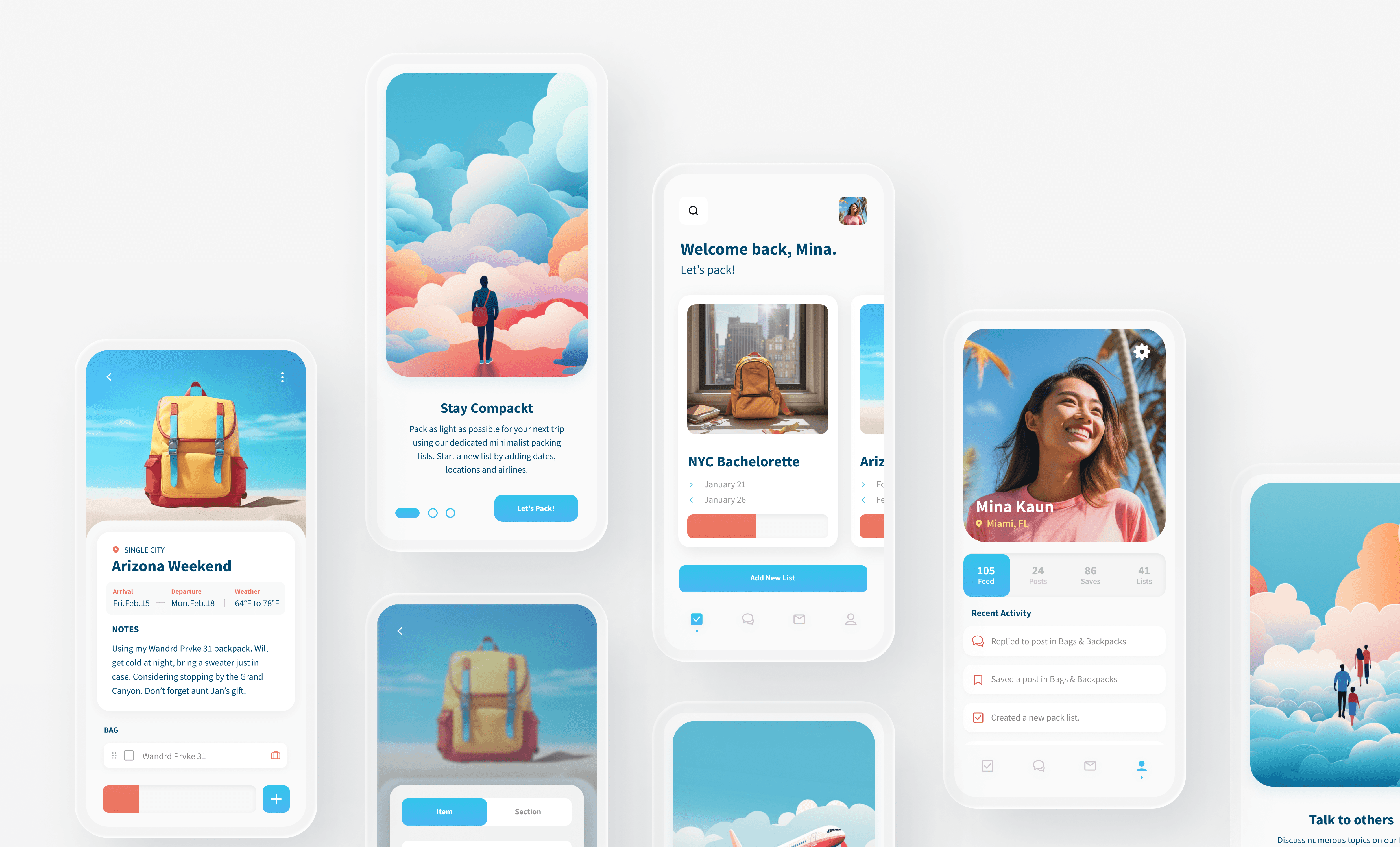
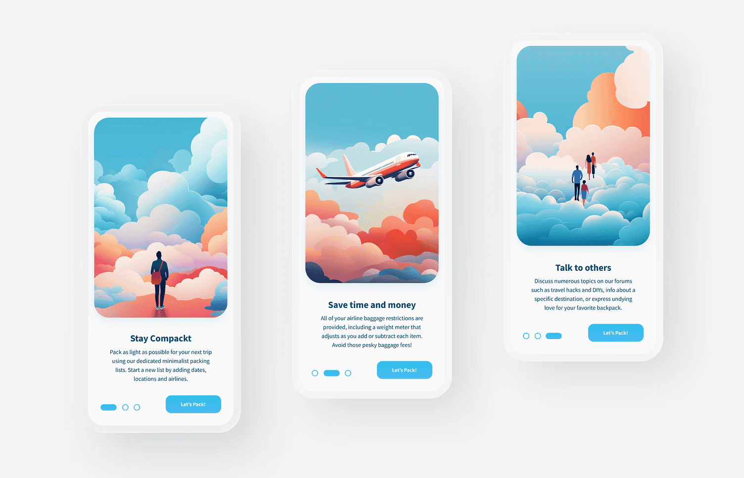
Welcome aboard!
ONBOARDING
In a world where globetrotters were overwhelmed with the current travel apps on the market, I embarked on a journey to design a mobile app with a unique twist for those who dared to travel with only a carry-on. Meet Compackt – a delightful solution tailored exclusively to the needs of minimalist travelers.
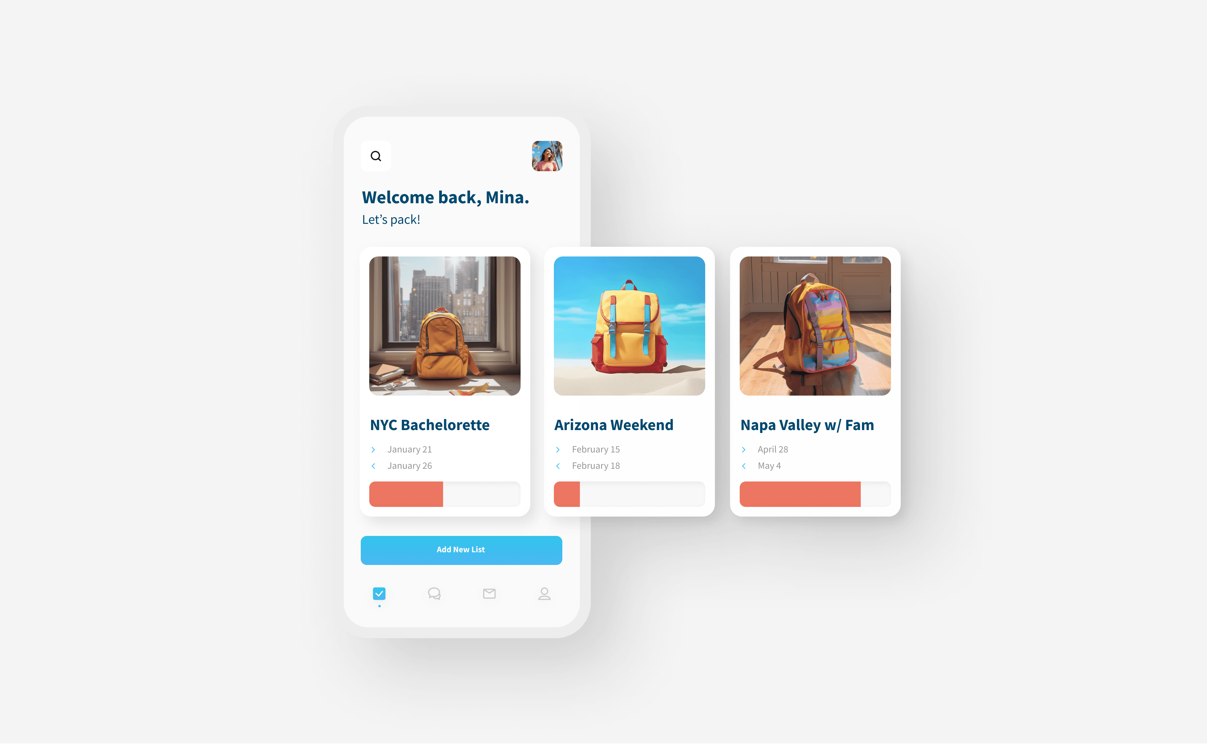
Nice to see you!
HOME SCREEN
Users are first greeted by their lists, organized by upcoming trip. Each list card provides a photo, trip dates, and a weight meter that displays how much is currently packed for that trip.
Why this screen works:
Keeps users focused on the upcoming task
Cards are clean and show only the important list info
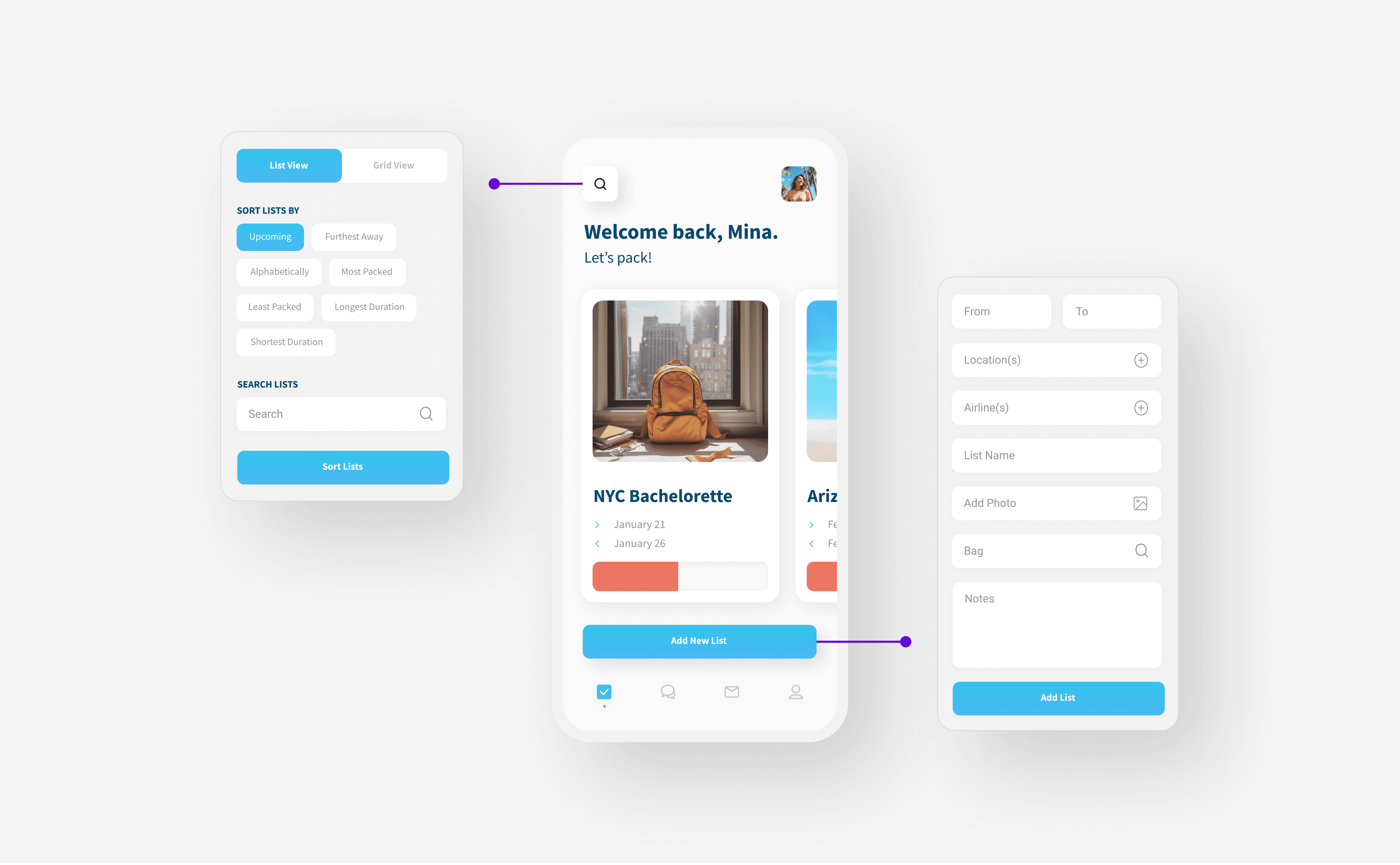
Adding and sorting.
HOME SCREEN ACTIONS
Where the user will be, for how long, and during what season are all considered when formatting a new packing list. Users are able to add multiple cities and airlines for their trip. By tapping the search icon, users can switch their lists from a horizontal scroll to a grid view. They are also able to sort lists by different attributes, or perform a general search.
Why these screens work:
The multi-add feature helps to provide both the temperature range for their trip and the carry-on restrictions for the strictest airline that they’re flying
The user is afforded many different viewing options for the lists on the home page.
Let’s pack!
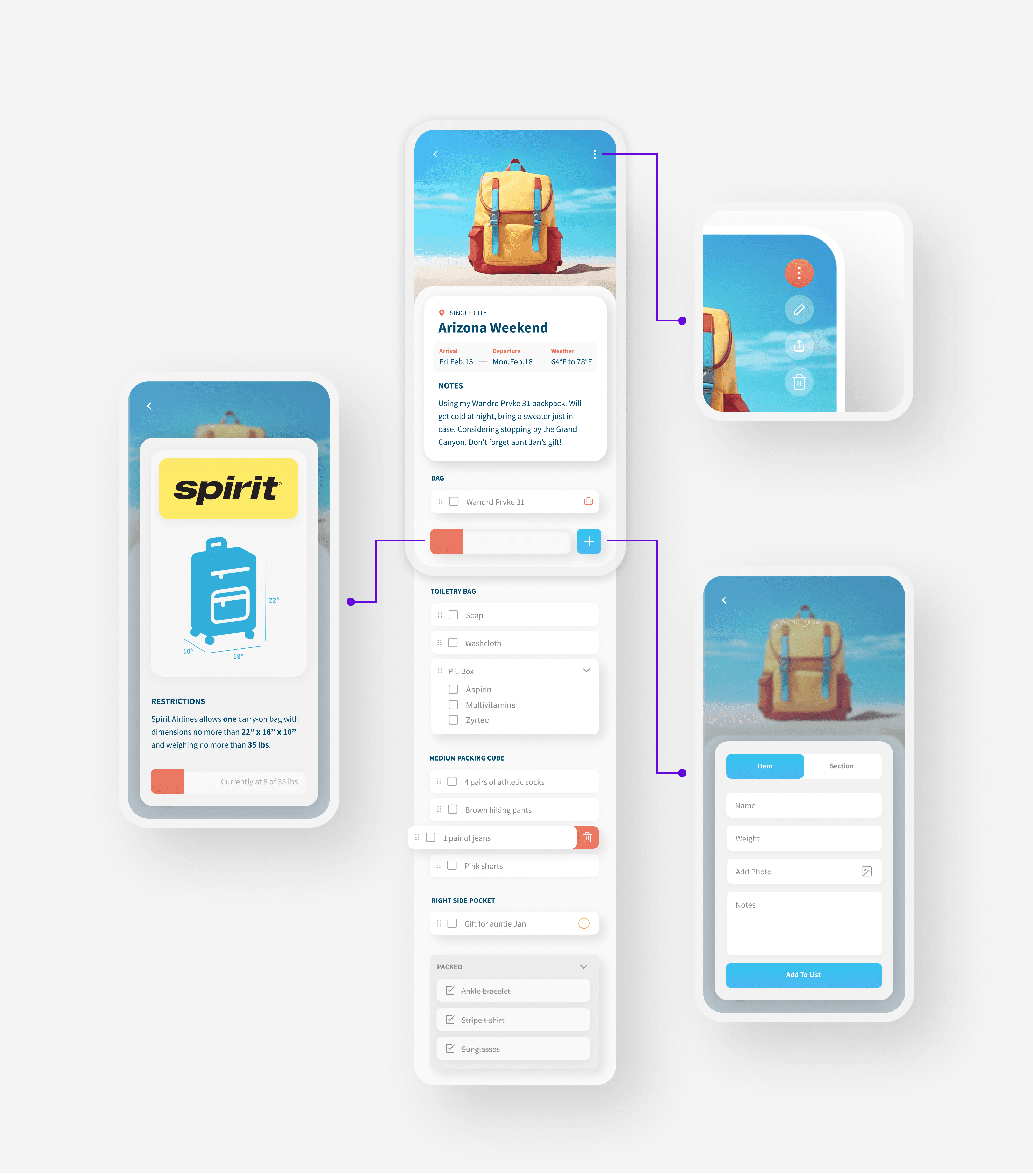
LIST VIEW
The list screen is home to an itemized list interface and an overview of list info. An expanding menu on the top right gives users the option to edit, share or delete the list. Gestural interactions such as tapping and swiping help navigate the userflow.
Add List Item Or Section
Weight Meter
Why these screens work:
High priority features (weight meter and add item) are stickied
Intuitive gesture-based controls for items
Bag is displayed as an item, since the bag contributes to the overall weight
Packed items appear greyed out
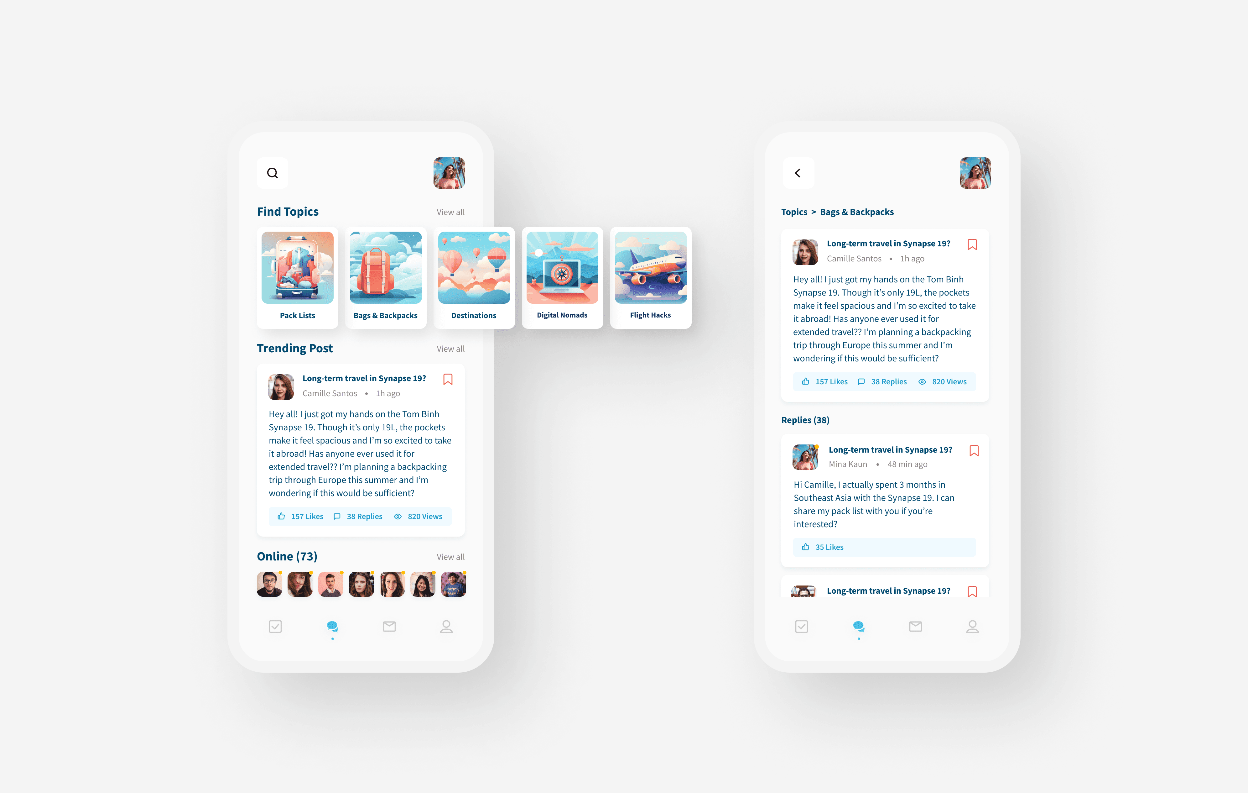
A one-stop-shop.
FORUMS
With the forums feature, users can finally ditch the plethora of websites they hunt for information in.
Why this screen works:
Three sections display only what’s needed
Trending post affords users more exploration
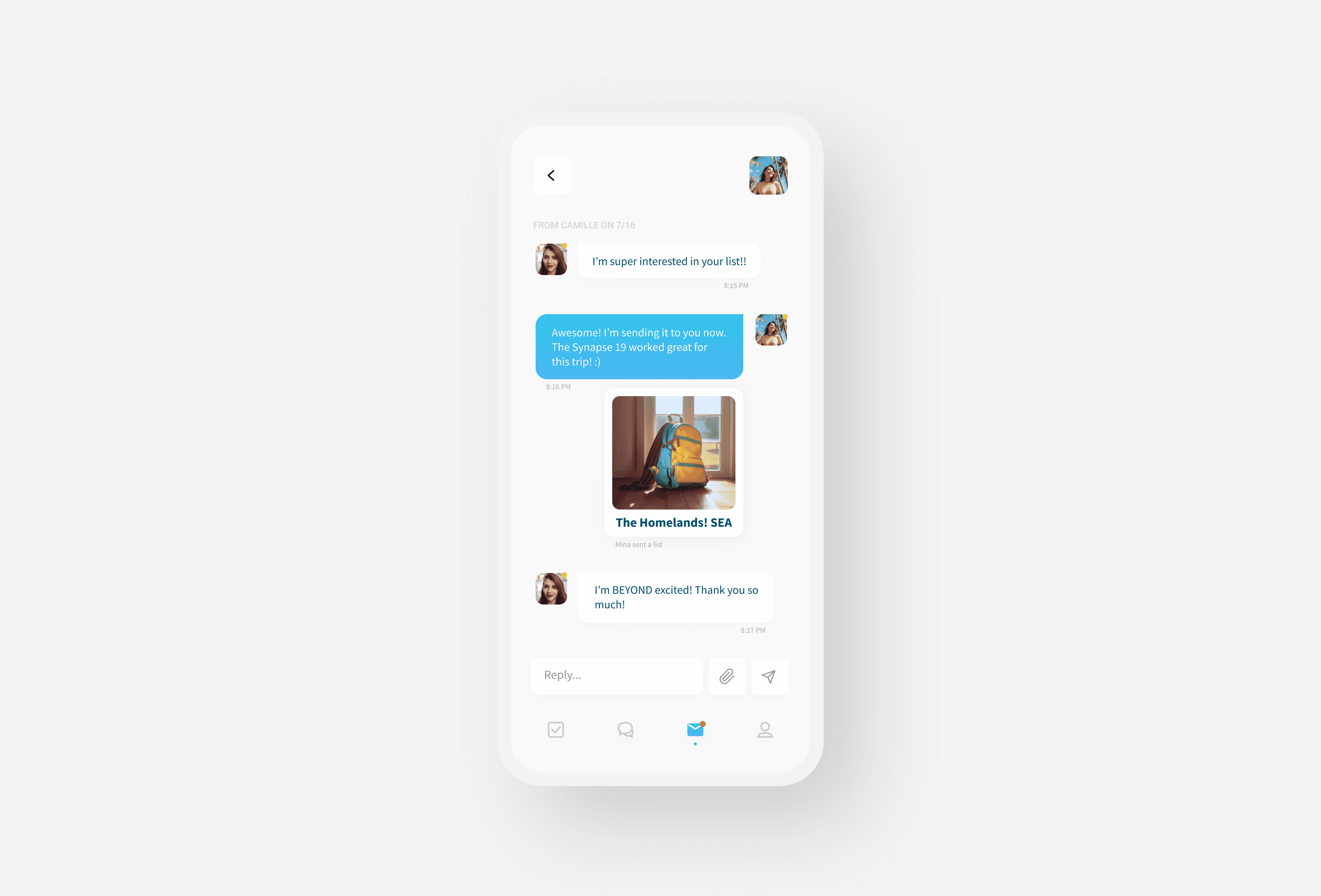
Check your DMs!
DIRECT MESSAGING
Users are able to communicate with each other privately, share their previous lists or even plan a meetup at their destination.
Why this screen works:
Intuitive chat UI similar to your text message screen.
There’s always room for improvement.
This was my first attempt at creating an app from scratch. There were some difficult moments that reminded me that I have much more to learn, but this also motivated me to dive in and get excited about the process!
Some key takeaways from this process:
Don’t reinvent the wheel.
Document everything.
Try to dig deeper.